Baabul Ilm Logo
Role
Graphic Designer
Organization
Baabul Ilm Education Society
Duration
August 2013–August 2019
Skills
Branding & Identity, Graphic Design
Tools
Illustrator, InDesign, Photoshop
Overview
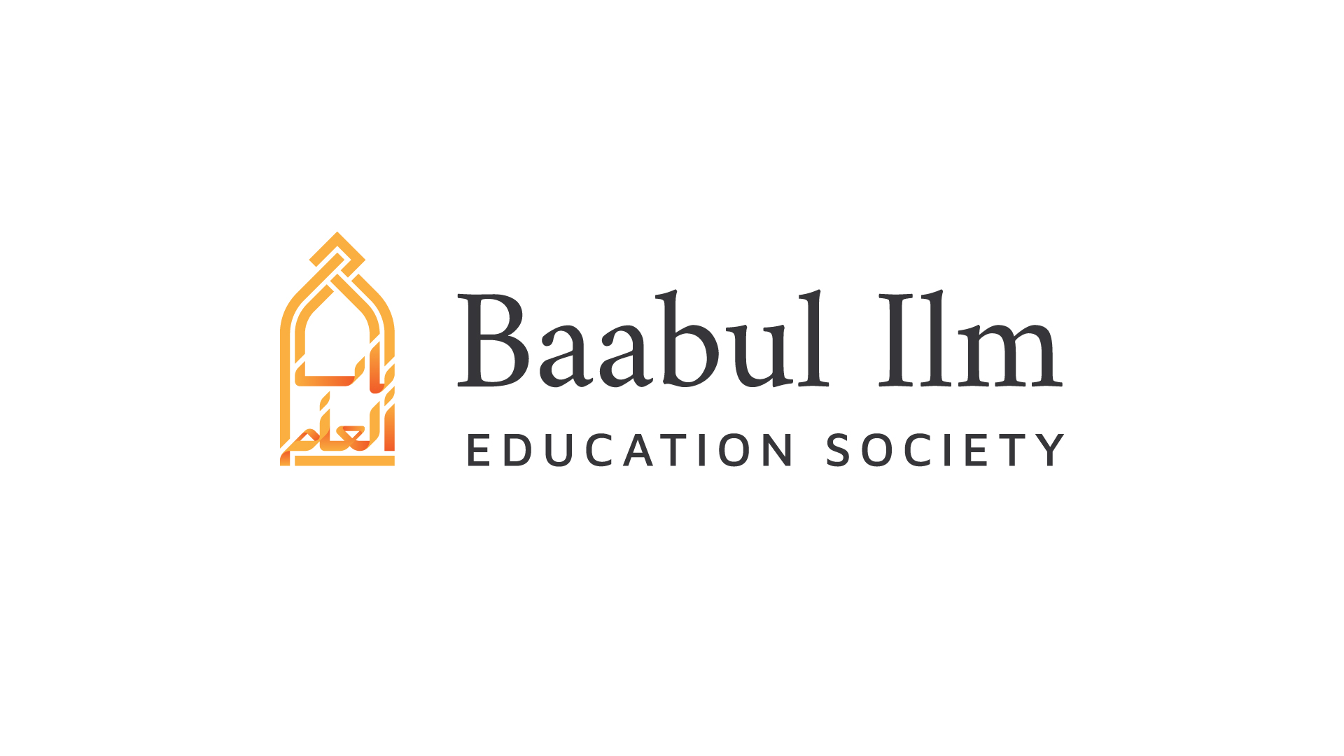
I was tasked with creating the logo for Baabul Ilm Education Society, a religious scholarship organization. The phrase Baabul Ilm means “gate of knowledge”, which holds religious significance in Islam.
Problem
In the original logo, neither Arabic nor Islamic imagery was used, the organization name only being written in English. While this functionally did the job of telling an (English-speaking) audience (Muslim students and their families) about the organization’s name, it evoked no flair or identity and was not memorable to its audience.
Process
To create a unique identity for the organization, I tackled different aspects of what would eventually become the logo.
Text
According to me, the most important thing that needed to be incorporated into the logo was Arabic text, as the English name of the organization is only a romanization, and not in its original form (Arabic).
To initiate this process, I studied the Arabic letters that made up the name apart and together (as the letters form differently when connected with each other). I also researched examples of writing styles such as Kufic calligraphy (a style of geometric illustration) and Arabic logotypes.
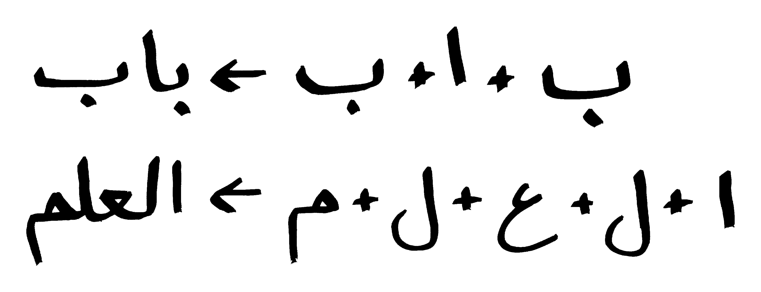
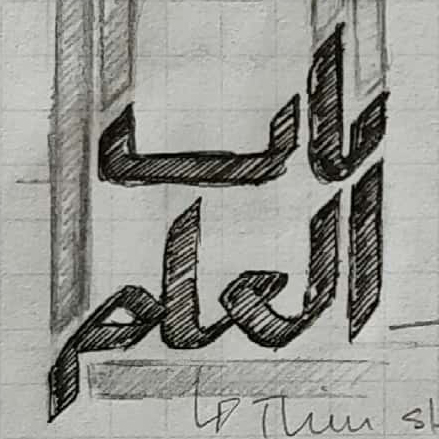
I decided the stroke of the letters based on how Arabic calligraphy is written with an angled writing tool. Throughout the process, I referenced the original letters to see if it was legible. I did this because Arabic calligraphy is an art form—different from writing it, which I was not fluent at.
Imagery
To find symbols I could use for the logo, I researched Islamic and scholarship organizations, and found they commonly used mosques and books in their logos (respectively). But because they were used so frequently, I decided to use the door as an element because it directly relates to the name and was rarely used in organizations of the same name (religious phrases are commonly used for different types of religious organizations).
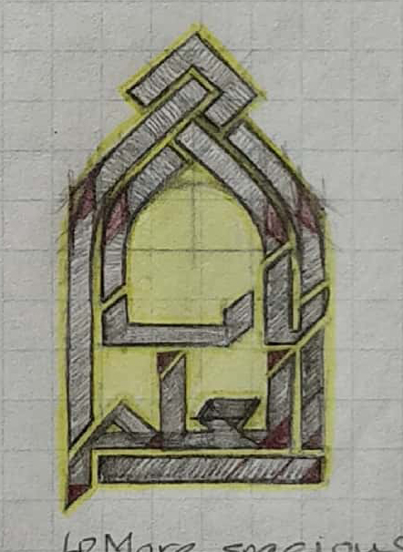
The shape of the door was based on preliminary research of Islamic architecture and personal experience. The door outline was made the same width as the Arabic text, and to make the shape more interesting, Kufic knots were added at the top based on research and examples of the style.
Combining the Script & Door
The shapes of the script and the door were decided with the fact that they were going to be together in mind, and changes on either influenced each other throughout their iterations.
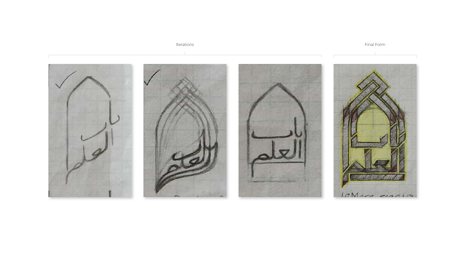
To bring the script and the door together, I sketched different forms of them until I found a pleasing form. As I had already mentioned, I made the door outline the same width as the script.
Logotype
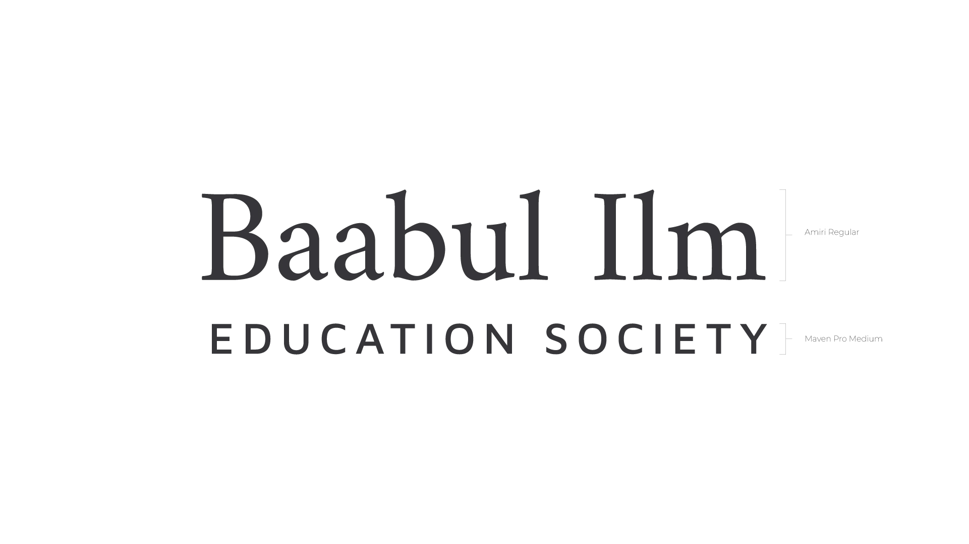
Because the logomark was a more pressing concern in getting across the religious background of the organization than the logotype (which performed its purpose anyways), I kept its existing form and refined it with new fonts, justifying the use of the serif for the name to keep it a formal and educational tone, and using sans-serif in uppercase for the rest to fit under and distinguish it from the name.
Colours
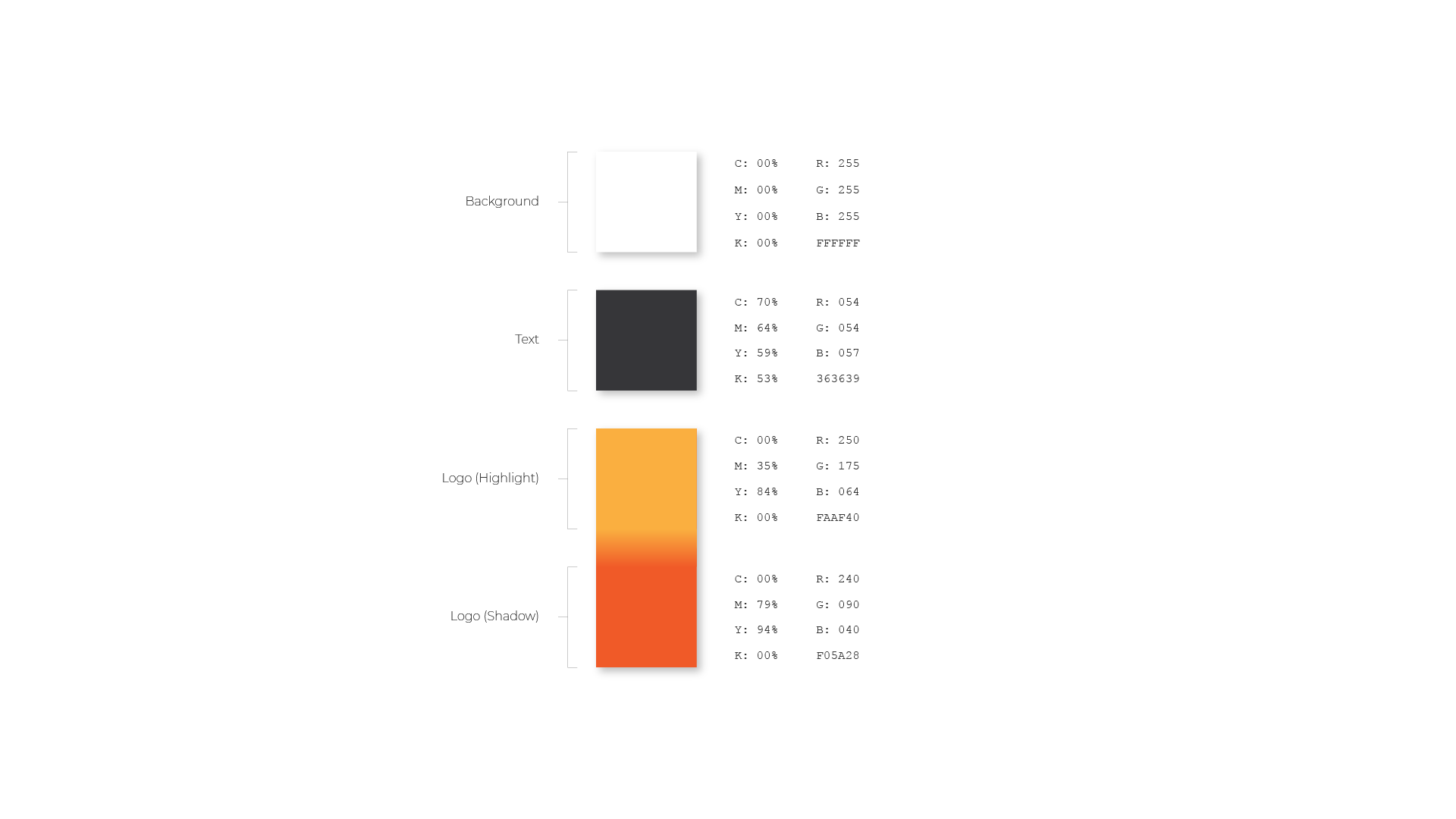
Though there are many colours associated with Islam, deeply associated ones (such as green) would distract from the educational context of the organization; instead, subdued colours were used. This decision was justified by the fact that the logomark would get the religious nature across.
Combining the Logomark & Logotype
Combining the logomark and the logotype was a matter of matching the height of the logomark to the height of the logotype; this was because the logomark is taller than it is wide.

Details
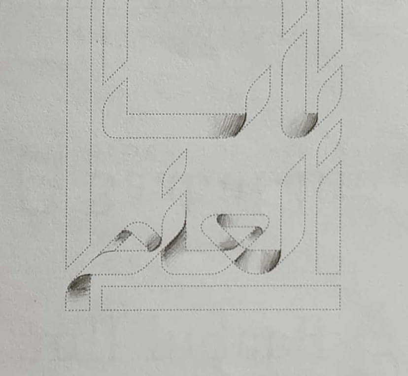
One detail I wanted to showcase was distinguishing the direction of the stroke in the calligraphy with shadows (using gradients in the final product) on overlapping strokes (imitating the way existing strokes would be drawn over in calligraphy). Any overlapping stroke was highlighted by being given a shadowed edge.
Challenges
Although I am a native Urdu speaker which uses the same script as Arabic, I did not know much beyond simply writing the organization’s name in Arabic at the time.
As I mentioned before, I split up the letters and observed how they looked apart and connected. I also researched Arabic calligraphy and logos to see the liberties designers took with the lettering, allowing me to abstract the letters from their original form to design a logo.
Retrospective
The primary lesson I learned from this project was that my client did not have anything particular in mind when they asked me to make a logo. It was left up to me to ideate forms they could choose from. This resulted in me learning how to narrow down open-ended projects to only a few constraints. In this project, I prioritized the creation of the logomark over the logotype, as Arabic text and Islamic imagery was sorely needed to get across the religious nature of the organization, giving it an identity and making it memorable to its audience.
Something I would have done differently for this project is to have taken more creative risks and have experimented with different colours that are more deeply associated with Islam, not only to imbue religious significance in the organization’s identity, but to make it more visually interesting as well.