CRC EDI Course
Role
Interactive Training Developer
Organization
Simon Fraser University, Institutional Strategic Awards
Duration
September 2020–October 2021 (Co-op)
Skills
Branding & Identity, Graphic Design
Tools
Illustrator, Figma, Articulate Storyline 360, Canvas
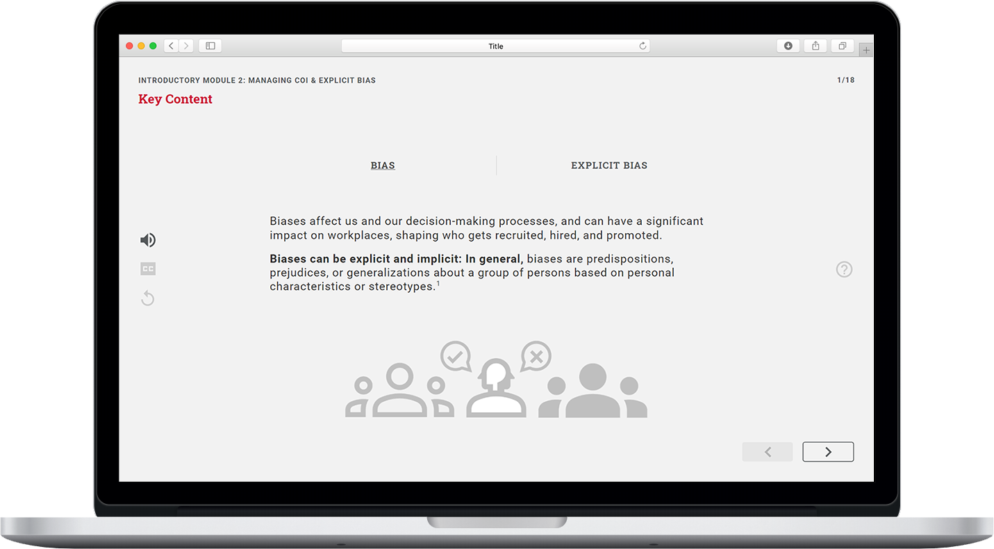
Overview
As part of SFU's initiative in being more fair and equitable, an interactive training module was needed that would teach practices in hiring diverse Canada Research Chairs.
The goal was to have a training module that was engaging and interactive for users to go through in learning these practices.
A Two-fold Problem
Engagement & Interaction
The course needed to be engaging and interactive for users to be able to go through it and consume information which they would later recall and refer back to.
Development & Maintenance
While having engaging and interactive features, the course also needed to be developed with maintenance in mind, where non-developers could edit evolving content in the future.
Approach to Solution

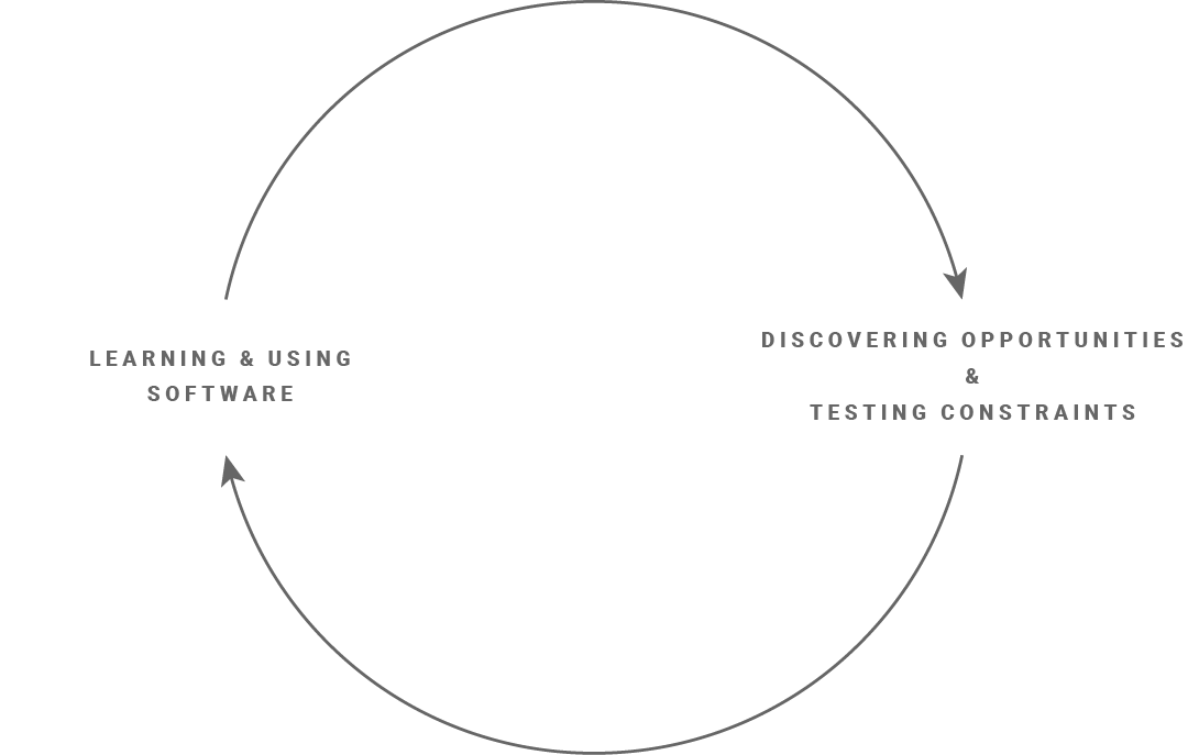
A simultaneous process that informed each other.
To be able to produce a product, I first had to immerse myself in the content to be able to understand how it would best be represented and also to research course design as well as the previous course to produce wireframes.
Research
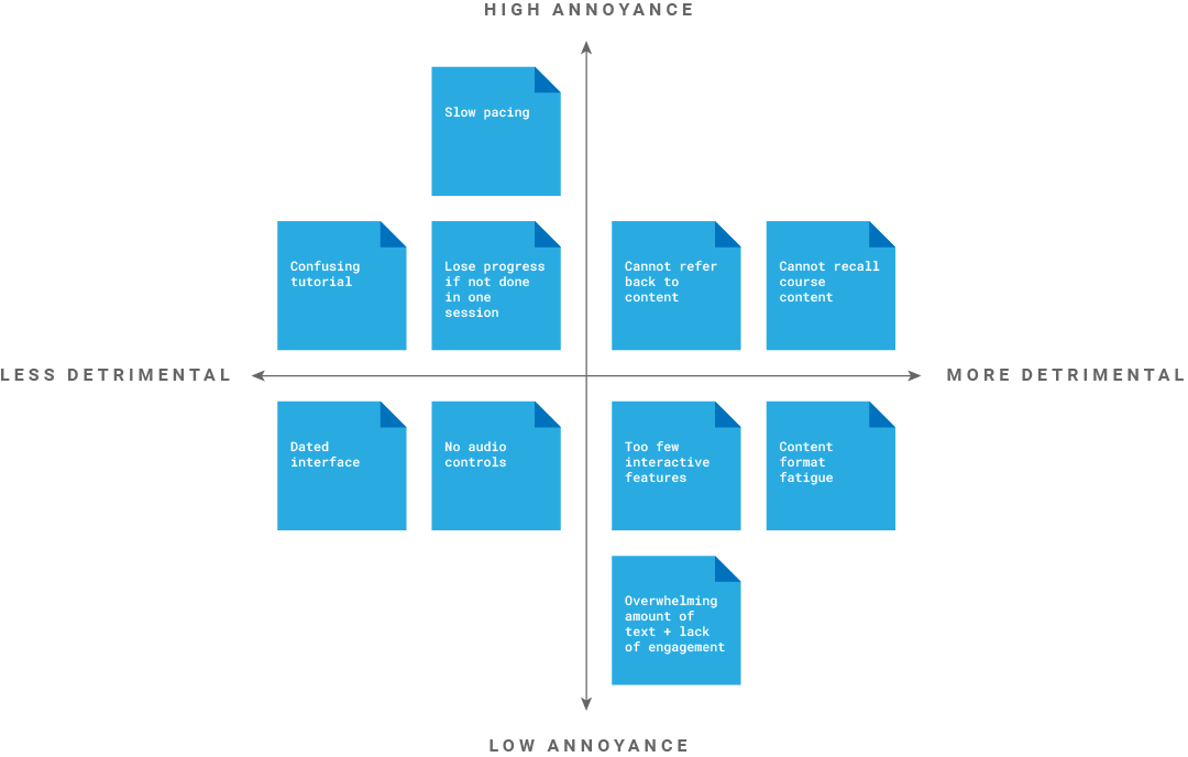
Research was conducted on two aspects of the goal: (1) To research the existing audience of the current course used to find out what it did right and wrong and (2) Find inspiration and references from other courses and course design software.
A busy audience
To have a starting point when starting to design the new course, I conducted user research on the audience of the previous course this project was based off of.

User research took the form of online surveys partly due to the pandemic as well as the limited time of the audience who were working on project-based deadlines. This partially informed me that the course to be created would need to be easy to learn and not clash with the content.
To make it easier for survey-takers to answer the questions, certain aspects of the existing courses were rated and then a choice was given to elaborate if they wanted to. Questions involved the content of the course, the navigation and ease of learning to use it.
Inspiration & references from precedents
Another question asked to the survey-takers as well as my supervisors was if they recommended any courses that they enjoyed taking and did things right. With an example given to me, I asked what they liked about it and also went through the course myself to note down what they mentioned, allowing me to begin to form ideas on what could be implemented and kept.
Research on the software to be used to create the course was required because the company offered multiple products with different features. With the audience research in mind as well as what was needed to be accomplished I wrote a proposal on the pros and cons of each software and what the best product would be. This resulted in research about not only what features the product offered, but its constraints, as well as ideas of what could be done with the content to make it more interactive.

Immersion
Immersion into the content and software was required to be done simultaneously to see what was possible and also make progress in laying out the structure of the course via categorization to make it easier to template the vast amount of information that was going to be shown.
Managing an overwhelming amount of content
Compared to the content that is to be implemented into the new course, the previous course would only be considered a section of it. The content given was only composed of text, and divided into three parts with multiple headings underneath, where the body varied from section to section, requiring me to skim through it to be able to determine a pattern between content.
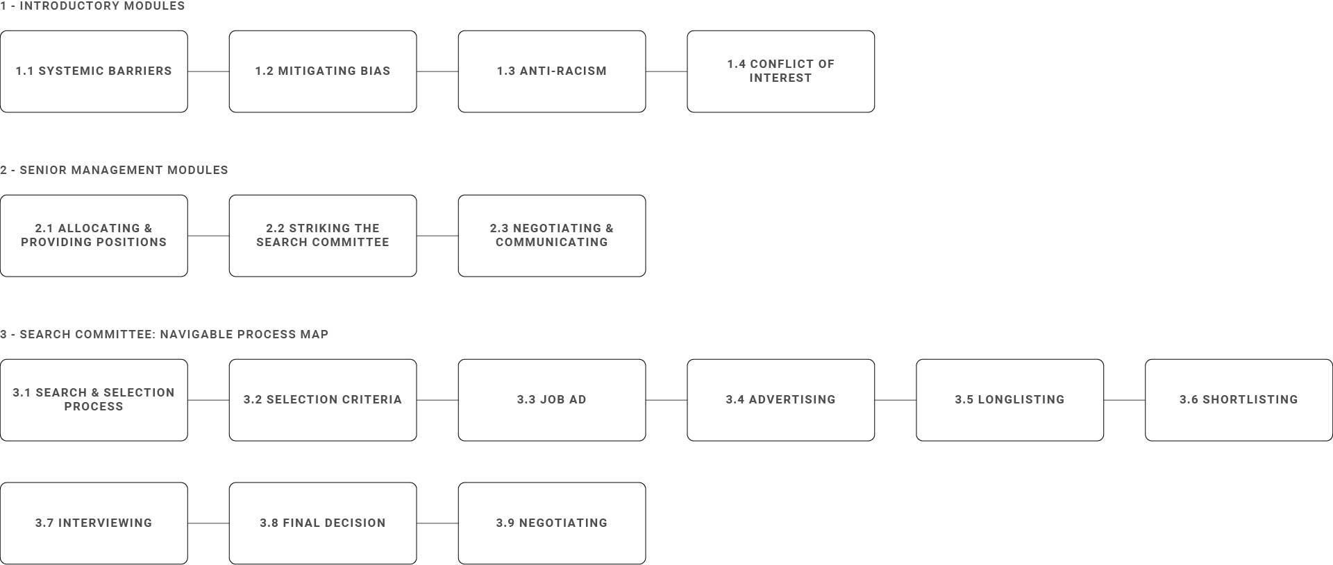
An important part to categorizing the content was to see how it was going to exist for the user, and how they would access and move through it. This allowed me to see what could be made into a repeating element that could consistently be represented across the course, and what would need to be tackled individually and possibly further categorized.

Trying out features and testing constraints
With the architecture of the content mapped out, I tried and learned the software to see how the user would move through these spaces and what was possible with the program. This allowed me to think about the functional side of the course and how the user would move back and forth and access different parts of the content, as well as other functions that would be needed, depending on my research.
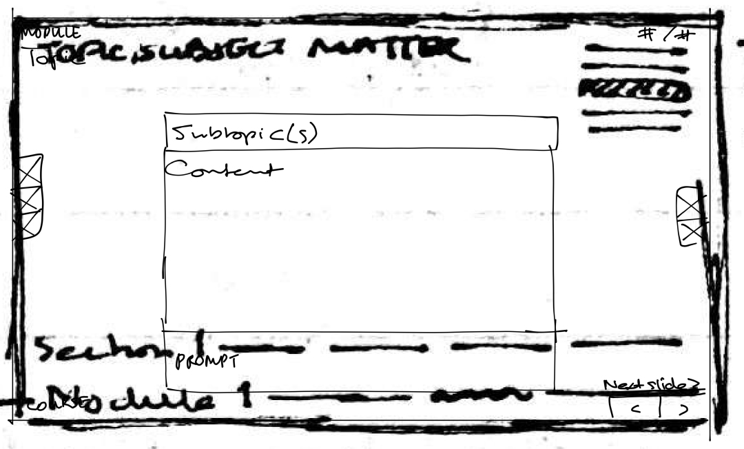
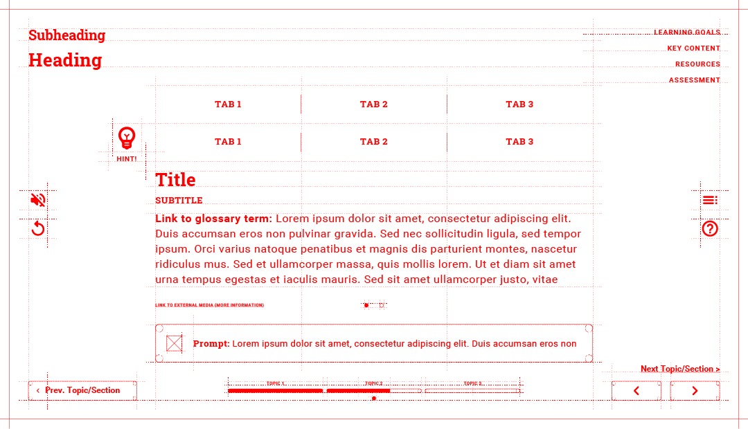
Features would include indicating where the user was currently in the course, audio control (sound on/off, subtitles, replay), homepage and help buttons, and navigation controls for moving through the slides.
Production
Production involved continued learning and use of the software to house evolving content, being ideated and iterated from low to high fidelity mockups, eventually into functioning prototypes, with testing and revisions steering it to completion.
Wireframing & prototyping
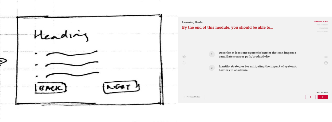
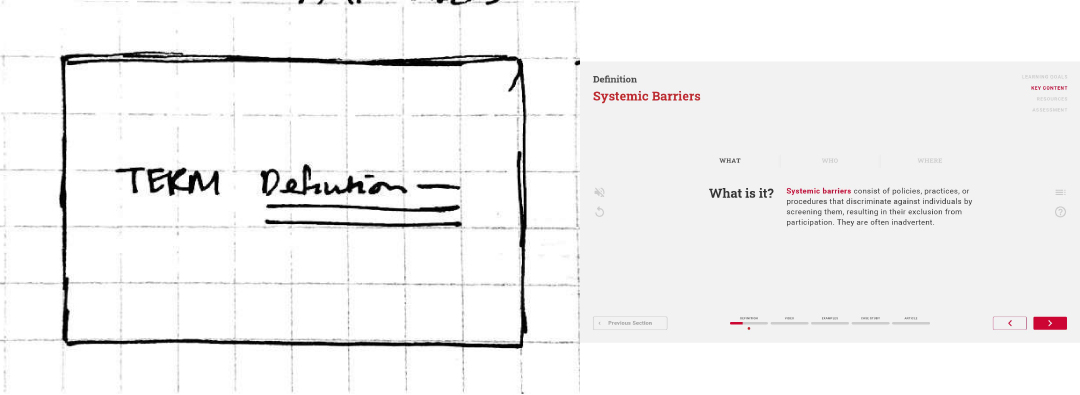
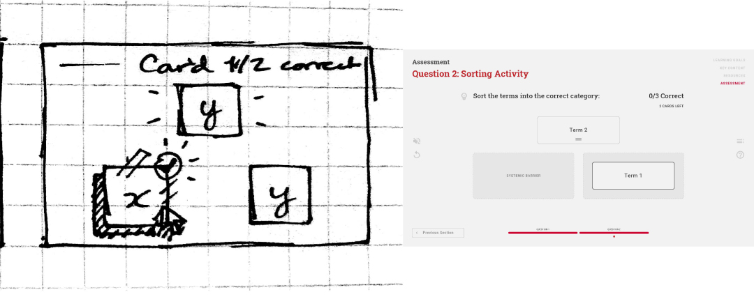
Sketches evolved into wireframes and eventually low and medium fidelity mockups that would be showcased to supervisors to make sure they stayed on track, and implemented feedback if needed.
Tools included Figma, Illustrator (mockups) and Articulate Storyline 360 (prototypes).

Continued simultaneous learning & production
Ideation and iteration of features and activities in parts of the course were prototyped into the final software to be used to make sure that it was possible and could work before applying it to all the content in the course.
User testing & revisions
User testing was conducted when prototypes were produced in the software with an easy to share link to go to test said prototype. Comments could be made on individual slides which allowed the problem to be easily spotted and changed.
Productions of different sections allowed sections to be tested one after another and allowed changes across all sections if something was not working in one of them.
One piece of feedback given and resolved was where the user would move their mouse to progress through the course. Before, they had to move their mouse across the screen to get to different parts of the slide before being able to go to the next slide. For ease of use, it was changed to being able to progress using the next slide button even if the interaction was on the same slide to make it consistent to the user as to what they had to do.
Canvas migration
One major piece of feedback given was in regards to where the course would be housed. Initially, it was going to be a link to the course accessible through a LMS (Learning Management System), Canvas, where users would sign up to this course to access the link to the software produced course and go through it. But due to the limited tracking capabilities of the software, it had to be scaled back to allow the course runners to track if users had completed parts of the course, which was doable on the LMS. Thus, the software parts of the course became the course-content only parts of the course, with other parts such as quizzes being tracked by the LMS. This was a major revision as much of the features were built to run independently within the software, and scrapped. This had the added benefit of making it easier for maintenance of the course.
Final Design
Product Overview
This product is housed within an LMS; to try out the content component of this product, click on the button below (warning, audio will start playing automatically).
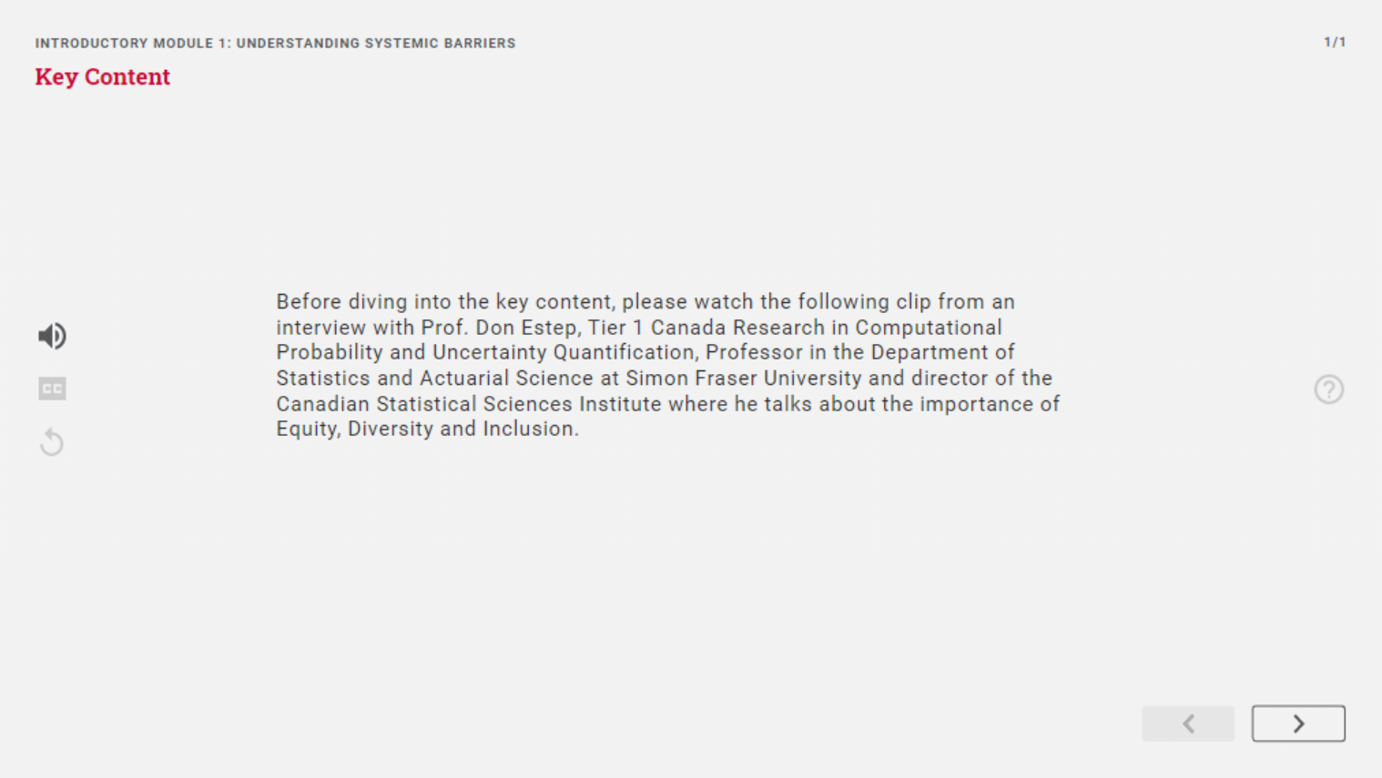
Features
Though the body of each slide may have different content types, the following elements will be present and consistent across all slides.
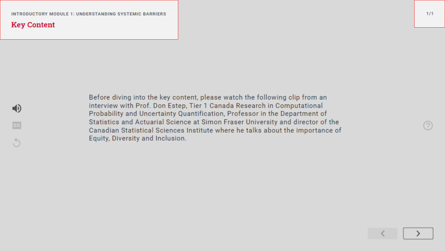
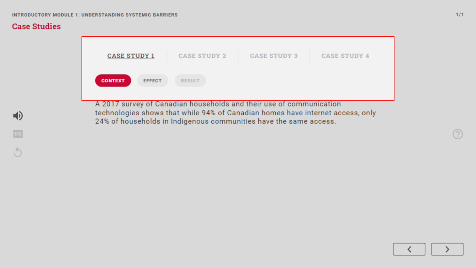
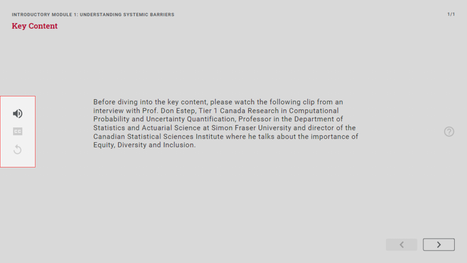
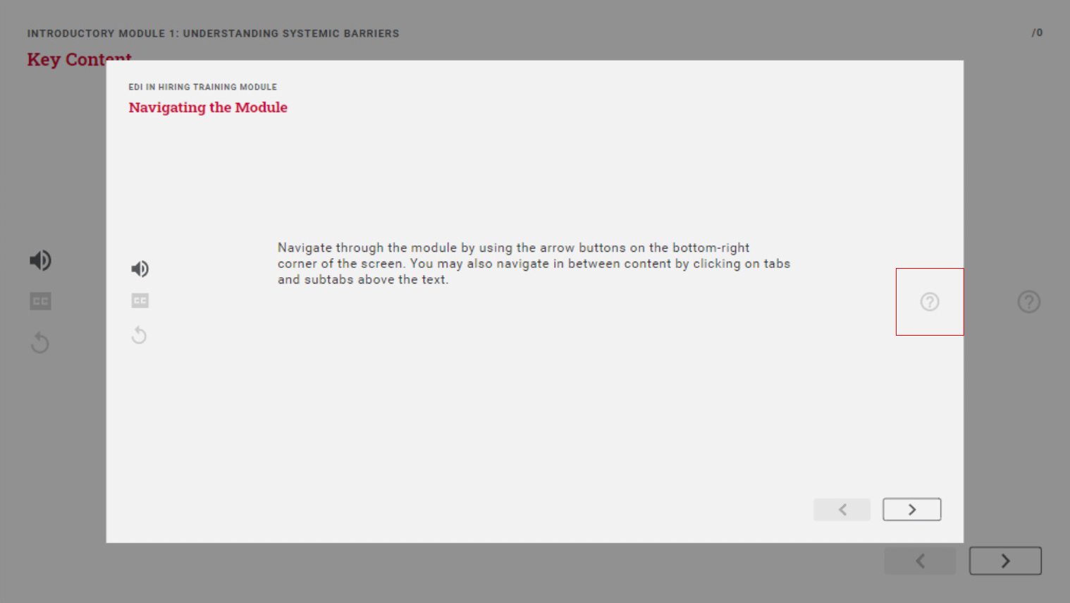
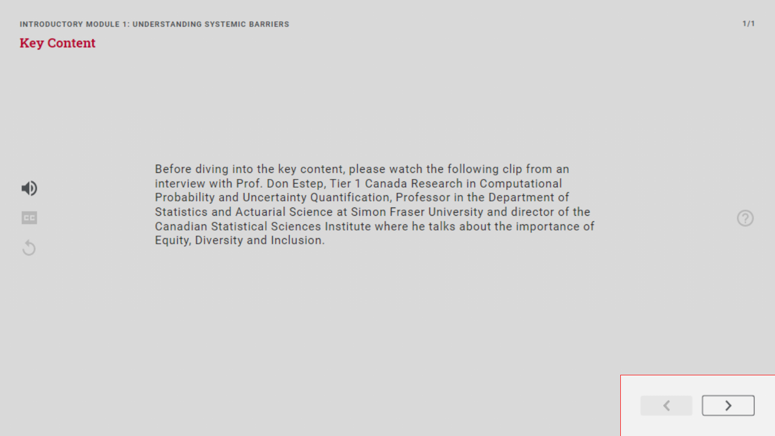
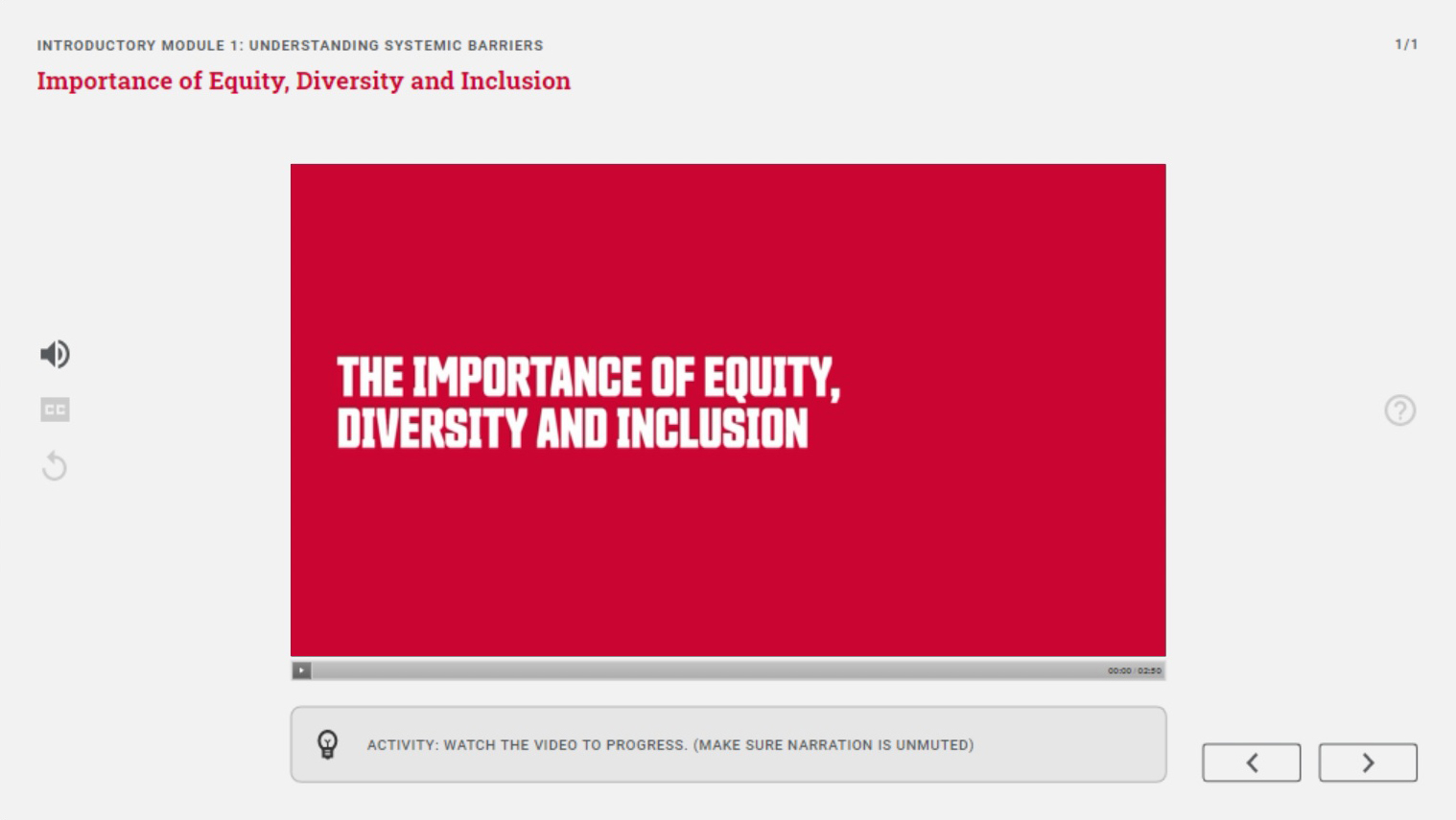
The following are different types of content presented in the body of the slides which are consistent with each other.
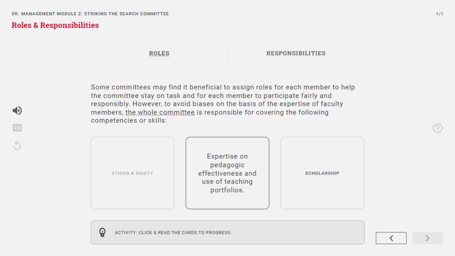
The following features are different assessment types designed to test the user's knowledge after going through a module.
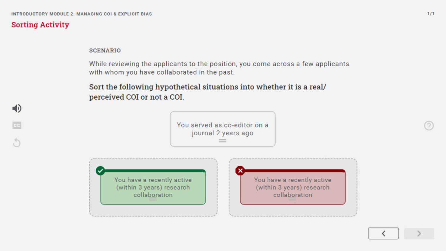
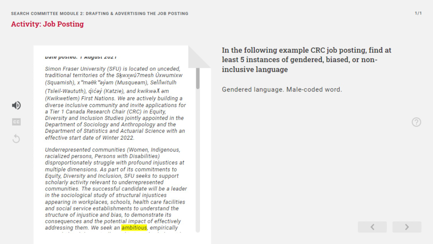
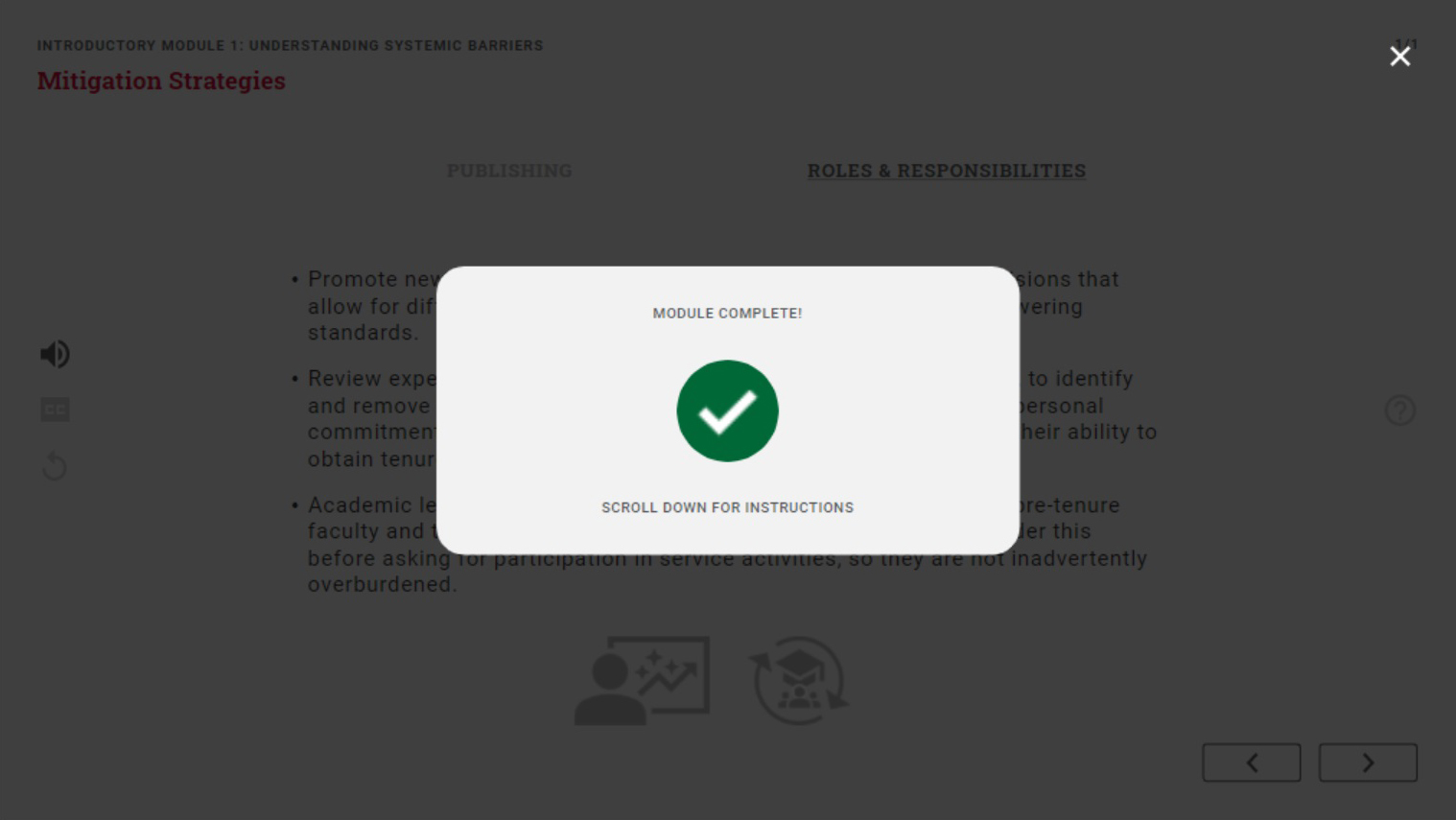
The last of the elements the user would see consistently throughout all modules is the completion screen, shown when the user clicks to go to the next slide when they are on the last one.
Interaction design is visually applied to the buttons in the module, to showcase what options are available to the user and what has occurred. This was also an opportunity to personalize the visuals with SFU branding.

Branding
SFU branding guidelines were followed in keeping consistent with the brand of the organization this course was being produced for, a stark difference from the previous course which was not associated with the institution.
Though there were not too many graphical aspects of the course, SFU colours were used to personalize the course through accents.
SFU branding guidelines could not be followed in typography, due to limitations with licensing and software. An alternative font was chosen for its readability and variety of font styles it had, which allowed for visual hierarchy through text.

Other Components
Other components that were a part of my co-op included graphics, LMS (learning management system) integration, certificates and video tutorials.

To avoid content fatigue when students are taking the course, to break up the text, graphics were included in the course. Due to time constraints, I could not create the graphics myself, and was entrusted to delegate an in-house graphic designer to create the graphics. This allowed me to practice such a role, as well as working with the branding team to make sure the graphics were on-brand, since they had not developed guidelines for iconography yet. I made sure to explain what was needed to be drawn by sketching and placing it in context.
I also learned Canvas, a learning management system, in order to house the course in it as well as set up assessments within as well as the course flow.
At the end of the course, the user receives a certificate, which I created a template of so it can be used to create custom certificates with the user's name.
To update the course, the software still needed to be used, so I had created video tutorials covering how to edit and republish the course.
Results
As the sole designer in this vast project, I learned a lot in each aspect of the project and because of the multiple roles aspect of this project learned to balance and prioritize. Deadlines and timelining and explaining my reasoning and caution in each stage of the project (research, consumption, learning, production, revision) allowed me to practice balance and know what to prioritize for next time.
The front and back-end audience for this project challenged me to make one product for two different users, which was to be engaging to the course takers but also make it easy to maintain for the non-designers running it. This meant that I could not implement some features I came up with as they were not sustainable for future maintenance.
Though I was able to achieve creating a functional product with interactive features, I would have liked to have the time to test the product more and in the context where the user was learning from it, rather than just checking the functionality and bugs. In the future, I would make sure to create a timeline that allowed more testing periods with a finished product, or compromise on a lower fidelity to test earlier.