SFU GPS Rebrand
Role
Marketing & Communications Associate
Organization
Simon Fraser University, Graduate & Postdoctoral Studies
Duration
April–August 2018 (Co-op)
Skills
Branding & Identity, Graphic Design, Marketing, Communications
Tools
InDesign, Photoshop, Illustrator, Hootsuite, Dreamweaver, Experience Manager, HTML, CSS

Overview
I was a Marketing and Communications Associate at Simon Fraser University’s (SFU) Graduate and Postdoctoral Studies (GPS) department. Part of my duties were rebranding the department through graphic design.
Problem
GPS had no unique visual identity, and used SFU’s general design guidelines, rendering it invisible next to other more uniquely branded departments.
Audience
The audience were graduate students and postdoctoral fellows of different ages and backgrounds whose primary source of information and help for their studies was GPS; we wanted to communicate this in the branding.
Process
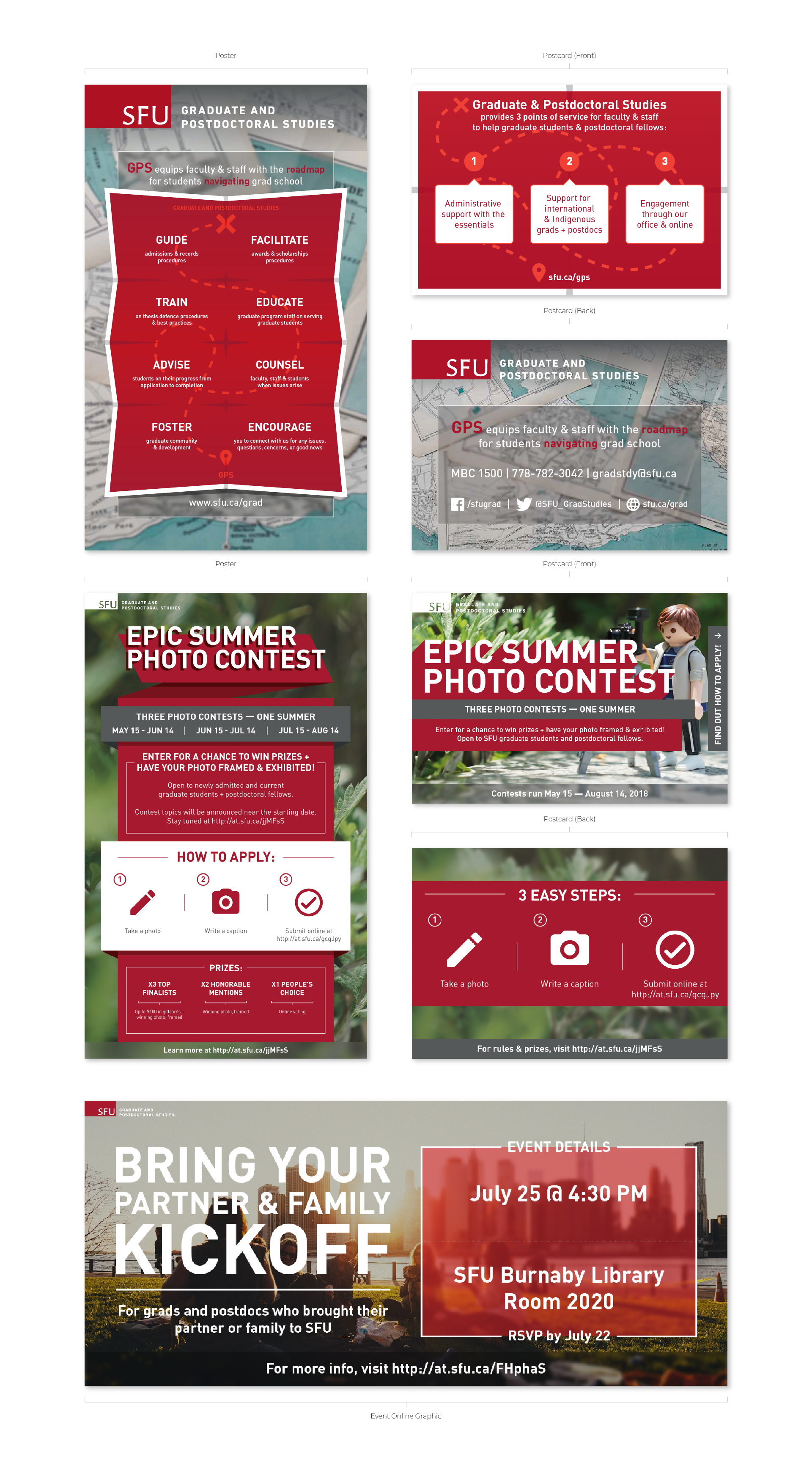
Over the course of my co-op, I had a few graphic design projects that required consistent elements that were either for me to follow or given to me, or developed as a part of the rebranding.

SFU Branding
In all graphics, I had to include the SFU logo and/or our departmental logo (following the rules for positioning and colour usage), SFU colours, and SFU fonts.
Copywriting
Copy was given to me by either my supervisor or my colleagues. At most my editing of the copy involved making it more concise and divided into step-by-step instructions for ease of reading.
Rebranding
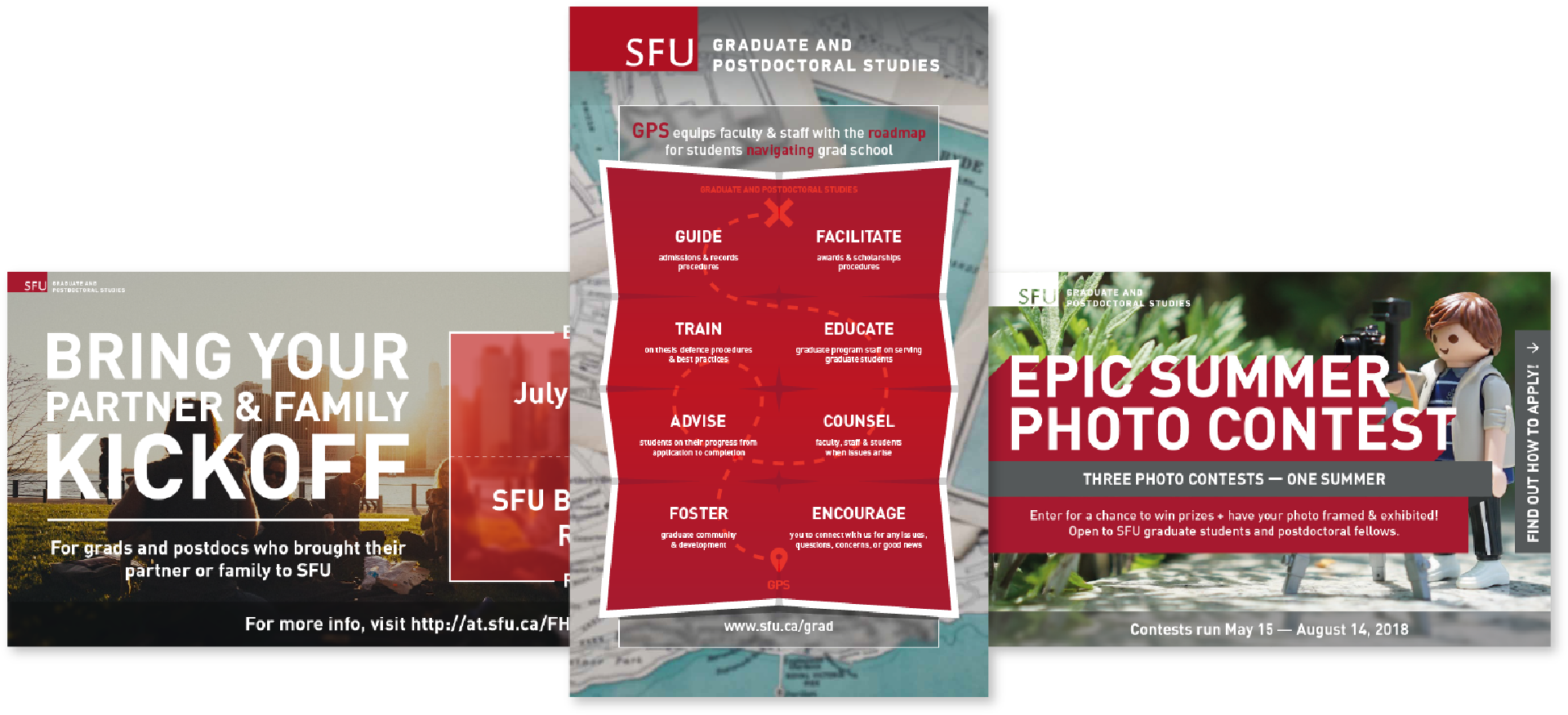
When rebranding GPS, we wanted to emphasize the initials ‘GPS’ for easy recall for the audience, thus navigational elements such as destination marks and crosses and travelling marks were used in the graphics.
Challenges
Balancing Identities
A challenge I came across in my co-op was balancing SFU branding with GPS’s own unique identity that was able to be developed in any direction; this was overcome by narrowing down design elements to navigational elements (influenced by the department’s initials ‘GPS’). This ensured that GPS acquired a unique visual identity that contrasted with SFU’s general branding that had to be followed (i.e. SFU logo, colours and fonts).
Trimming Copy
Another challenge was getting a sense of how much copy I could trim that was written by others for the design, but this was overcome by initially corresponding with colleagues, and eventually getting the hang of it without consulting as much.
Retrospective
At the end of my co-op, I was able to implement SFU branding in GPS’ graphics while distinguishing it from other departments, which resulted in a unique identity read as part of the university as well as its own department. I was also able to quickly produce design materials, allowing more time for feedback and adjustments, resulting in meeting estimated publishing deadlines in a real work environment.